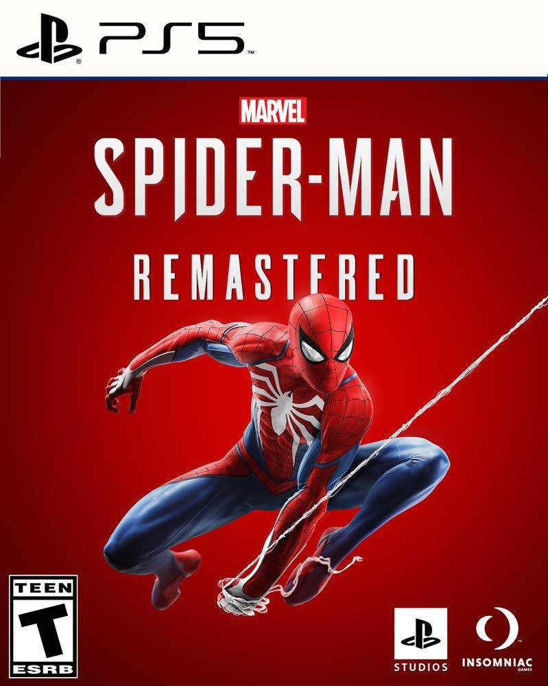
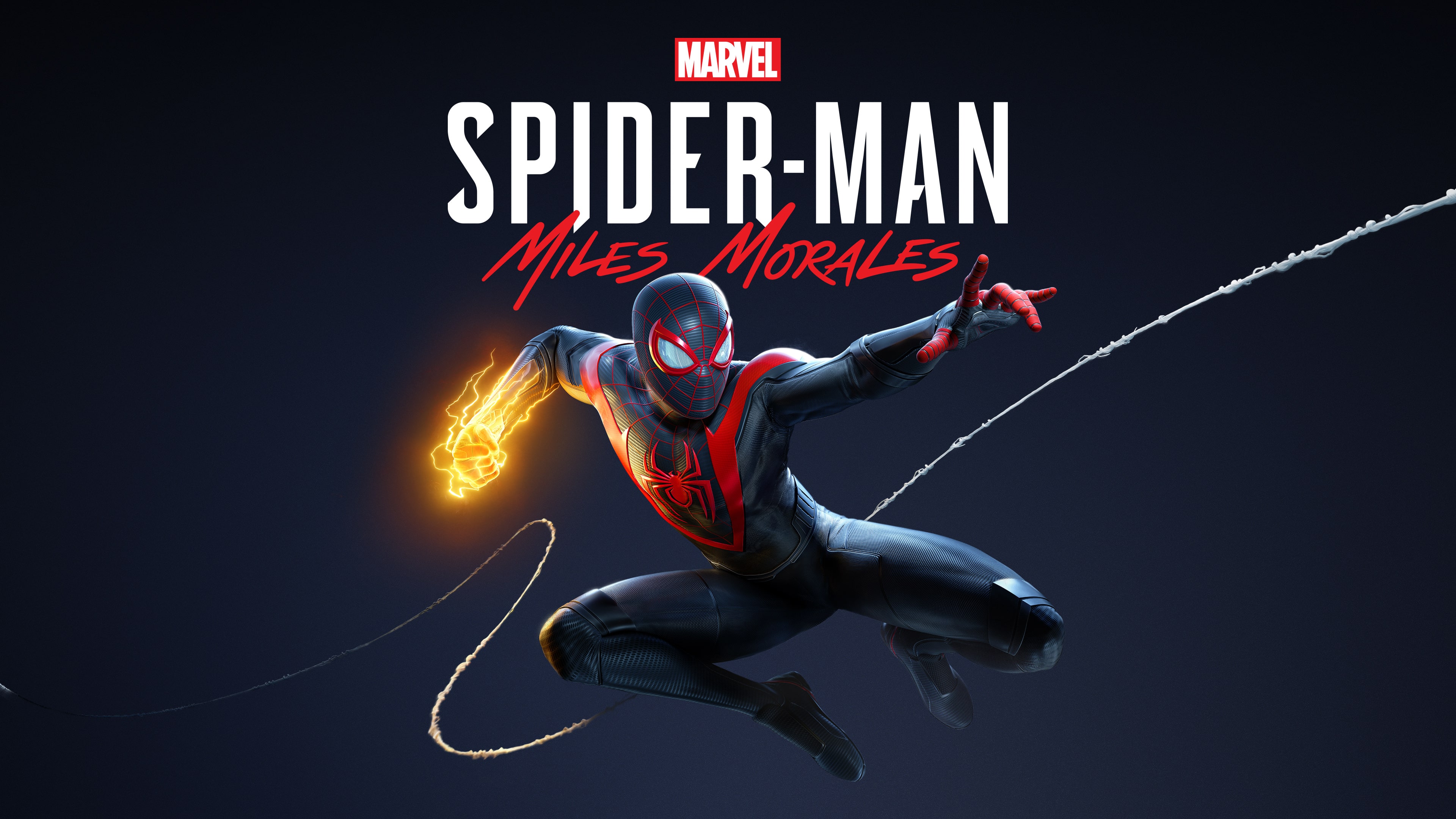
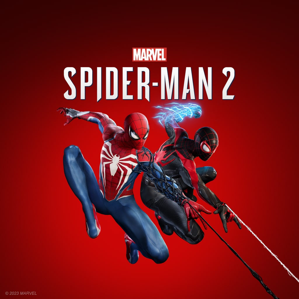
The poses are generic and the background is just a single color (red for SM1 and SM2 while SMMM is this light shade of black). I've always had an issue with game covers as most of the time they're pretty generic with just the player character being front and center as they do a generic dramatic pose but for whatever reason the Spider-Man covers just bug me more than usual.
Just take these posters in contrast with the one from Tomb Raider: A Survivor is Born

It's nothing extraordinary but it does a better job at helping to emphasis what the game is going to be about. Lara wounded and we can clearly see blood so this is going to be a graphic game. Their are ship-wrecks in the background and we're in a cave and Lara is holding a bow and we can see a pistol and climbing axe, this tells us this is likely going to be an action survivor game. And it's clearly raining, we're going to be dealing with storms in this game.
I'm able to get a better feel for what this game is about then ANY of the Spider-Man covers cause all those tell me is... Spider-Man is in the game... And they will be swinging. It doesn't tell me anything interesting, what the tone of the game will be or anything else. I just know this will be a Spider-Man game.
For all my issues with the DLC episodes of the first game the "covers" for said DLCs are interesting just look at the first one.
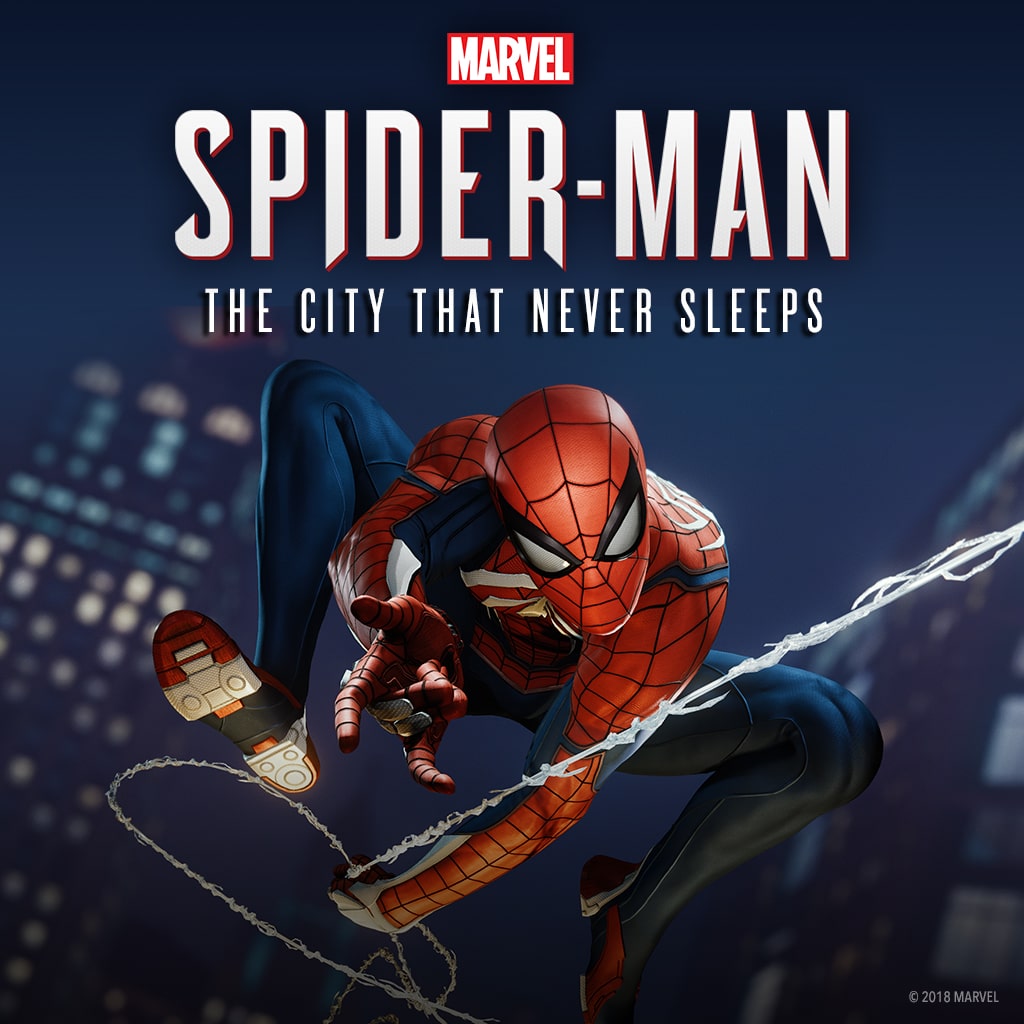
For starters the pose, this is a more classic Spider-Man swinging pose one that has been used on a LOT of comic covers and was even used as the final shot for The Amazing Spider-Man. Hell it was even one of the loading screens for the first game.
Second the background. While Spider-Man being set in New York is usually a given Peter has gone on adventures that have taken him across the galaxy and even to alternate realities. So seeing regular buildings in the background tells you this is going to be set just in New York. And finally this is obviously set at Night which helps to emphasis that the DLC will likely have a darker tone to it.
Contrast this with SM2's cover, is there ANYTHING that indicates this game is going to be a darker story then the first game? Not really, the most we get is the bit of black goo on Pete's left arm and even then it's not fully covering said arm so doesn't even look like it's a problem. Hell we KNOW Venom is going to be in this game and they're completely absent from the cover so it misses the opportunity to have an Evil Overlooker in said cover.
What bugs me more is this bit of concept art for the now cancelled game "Spider-Man: The Great Web" and I want to focus mostly on Miles here
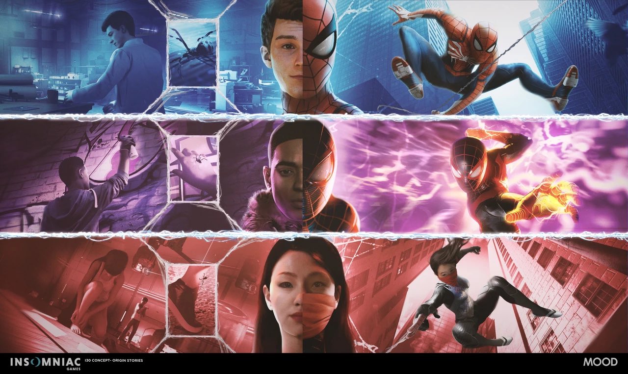
While this is concept art it's honestly a LOT better then the cover for Miles' solo game. The pose is a lot cooler and the background being engulfed by lightning makes it a lot more visually interesting.
I just don't get why the covers for the actually game are so... bland. They're not the worst covers I've ever seen for a game but they are the most boring and really don't do the games any justice.