I think the Sovereign was also the best ship design. Wish we had gotten to see more of it and the other ship designs that were developed post Wolf 359. But DISCO's Constitution-class is a thing of beauty in making the classic design look good on the modern screen, putting the Kelvin-verse's design to shame.
I think people sell the Galaxy-class short because of how it was used in TNG and the Enterprise-D's ludicrous defeat (it was just another "'cuz" plotpoint in that train wreck of a movie). Yesterday's Enterprise demonstrated how effective it could be as a pure warship. Able to carry an entire division of troops with the transporters and shuttles to move them (and could probably be configured to function as a carrier). It was also heavily armed, more than a match for anything the local powers fielded. Even the Romulans always met one with multiple warbirds despite being larger. They were also tough SOBs able to tank a lot of punishment. The only time we saw one lost in combat outside of massive fleet action was when their shields could be ignored and even then one was lost to ramming and the other to Generations being a terrible movie. But it's design was silly.
As for uniforms, I do think Enterprise had it the most right. Simple, functional, looks like something people working on a space ship would wear. I also like that they had common sense things like jackets and ball caps.
Star Trek Aesthetics

Re: Star Trek Aesthetics
Enterprise uniforms makes sense because they closely resemble uniforms and work clothes of today.
Enterprise-D was destroyed because they wanted to destroy the ship even in the early drafts. And to land the saucer too. But because Trek movies of the time had limited budgets, they had to make do with stock footage. And stock footage of let's say the Vorcha class wasn't good enough for the big screen. And it would have definitely jumped the effects budget. They would have had to redo the model too so it would look better on the big screen.
IMO, you could have easily inserted the Vorcha in that battle. Call it a early model so the cloak could be dropped. Then Enterprise getting overwhelmed without shields makes alot of sense.
In DS9 during the battle of Chintoka we saw the USS Galaxy herself take a huge hit exactly where the warp core is and didn't explode. I mean that hit practically cratored the whole Main Engineering room for that ship. In the second battle of Chintoka we did see one Galaxy class wreckage in the background. Though the saucer looked intact.
I got nothing to say here.

Re: Star Trek Aesthetics
TOS Enterprise imitated well the post-WWII US warship aesthetics of clean lines and an apparent minimum of weaponry. Many Cold Warriors I've known are fond of her and feel she's what a proper space warship should look like.Nealithi wrote: ↑Sun Mar 21, 2021 10:56 amNow I grew up watching TOS and seeing the movies before TNG came out. So I have fond feelings for the hero ship. But I also have to admit it has some blandness. The pearly white hull, the straight pylons. But the shape of the saucer and the long nacelles with the glowing front looked good to me.
She reminds me of Long Beach:

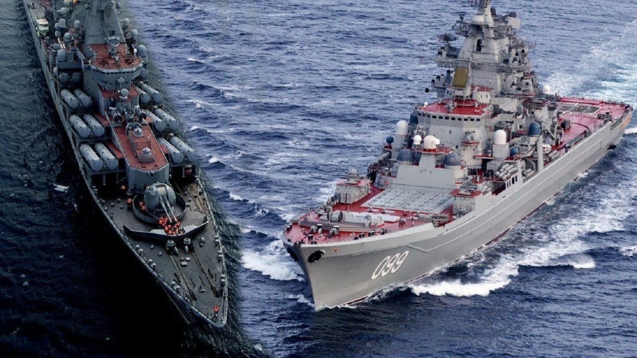
Incidentally, the US has run into a problem of "showing the flag" with their warships and their modestly appearing armament. They are effective warships, but don't look the part compared to Soviet designs that loved to litter theirs with different weapons and sensors that come off as intimidating:
I agree that Enterprise-D was horrendous. She was too stubby, and I find, reflects the epitome of Roddenberry's "Starfleet isn't a military" mindset.
Sovereign's long lines and bulky appearance evoke the last stages of US Navy battleship development:

It suffers from a worse problem that the South Dakota's had. The Sodaks were good ships, but looked too stubby to be as menacing as the North Carolinas or Iowas:Al-1701 wrote: ↑Sun Mar 21, 2021 7:06 pm I think people sell the Galaxy-class short because of how it was used in TNG and the Enterprise-D's ludicrous defeat (it was just another "'cuz" plotpoint in that train wreck of a movie). Yesterday's Enterprise demonstrated how effective it could be as a pure warship.


Re: Star Trek Aesthetics
Heh, my father served on the DLG-23 Halsey. Interesting perspective.
Though I disagree comparing the D with a battleship. She still is not that menacing. The obvious thing is to compare her to a cruise ship, but honestly she felt more like a container ship. She looks like she should be slow and ponderous.
-
BridgeConsoleMasher

- Overlord
- Posts: 11718
- Joined: Tue Aug 28, 2018 6:18 am
Re: Star Trek Aesthetics
I disagree with the last part about the South Dakota versus the North Carolinas. Asthetics are eye of the beholder of course, but because the SoDaks were shorter and much more compact they gave off a more menacing appearance then the Iowa or North Carolina classes. Those classes were longer and had a sleaker design. Capabilities wise, SoDaks were better ships than the North Carolinas and marginally less than the Iowas if you ignore the speed difference.Beastro wrote: ↑Thu Mar 25, 2021 10:58 pmTOS Enterprise imitated well the post-WWII US warship aesthetics of clean lines and an apparent minimum of weaponry. Many Cold Warriors I've known are fond of her and feel she's what a proper space warship should look like.Nealithi wrote: ↑Sun Mar 21, 2021 10:56 amNow I grew up watching TOS and seeing the movies before TNG came out. So I have fond feelings for the hero ship. But I also have to admit it has some blandness. The pearly white hull, the straight pylons. But the shape of the saucer and the long nacelles with the glowing front looked good to me.
She reminds me of Long Beach:
Incidentally, the US has run into a problem of "showing the flag" with their warships and their modestly appearing armament. They are effective warships, but don't look the part compared to Soviet designs that loved to litter theirs with different weapons and sensors that come off as intimidating:
I agree that Enterprise-D was horrendous. She was too stubby, and I find, reflects the epitome of Roddenberry's "Starfleet isn't a military" mindset.
Sovereign's long lines and bulky appearance evoke the last stages of US Navy battleship development:
It suffers from a worse problem that the South Dakota's had. The Sodaks were good ships, but looked too stubby to be as menacing as the North Carolinas or Iowas:Al-1701 wrote: ↑Sun Mar 21, 2021 7:06 pm I think people sell the Galaxy-class short because of how it was used in TNG and the Enterprise-D's ludicrous defeat (it was just another "'cuz" plotpoint in that train wreck of a movie). Yesterday's Enterprise demonstrated how effective it could be as a pure warship.
The Galaxy class I think suffers due to the oval theme of the design. The saucer is wide and gives the ship a top heavy look. Especially at some angles like from the bottom front angle. I think it also suffers from having gentle lines. No hard breaks in its lines. The lines are clean and flowing. It has a ton of windows and the weapons are hard to see.
I got nothing to say here.
Re: Star Trek Aesthetics
I think in ways Roddenberry took it too far. Ent-D has all the cruise ship antics going on and it also happens to have the warship qualities of Federation spaceships toned down. I don't see that as a coincidence.
They do look more rough and tumble, but at the same time that truncated end often makes them look almost menacingly cute, like a Tasmanian Devil.McAvoy wrote: ↑Fri Mar 26, 2021 3:55 am
I disagree with the last part about the South Dakota versus the North Carolinas. Asthetics are eye of the beholder of course, but because the SoDaks were shorter and much more compact they gave off a more menacing appearance then the Iowa or North Carolina classes. Those classes were longer and had a sleaker design. Capabilities wise, SoDaks were better ships than the North Carolinas and marginally less than the Iowas if you ignore the speed difference.
The Galaxy class I think suffers due to the oval theme of the design. The saucer is wide and gives the ship a top heavy look. Especially at some angles like from the bottom front angle. I think it also suffers from having gentle lines. No hard breaks in its lines. The lines are clean and flowing. It has a ton of windows and the weapons are hard to see.
More appropriately tough looking, yet stubby, warships are the old 21kn battlewagons.

The saucer isn't the problem, it's the rear. Both they and the SoDaks look like only half a warship. The bottom body section is far too small and the worst bit is the curving of the nacelle connectors. Enterprise-A's might have been impractically narrow to survive combat, but they gave off a wonderful fighter jet-like quality to the ship, like the F-86 with its swept wings.
Re: Star Trek Aesthetics
The old battle wagons of WW1 they all had a nice agressive look to them all. Americans had a bare basic look to them, but looked great. With the exception of the cage masts, which made them purely American. That period is a interesting period for the US Navy. The modernizations of the 30's did make some of the battleships look interesting. Like the New Mexico class had a nice look with their blocky super structure. Or the big tripods on the earlier classes.Beastro wrote: ↑Fri Mar 26, 2021 5:51 amI think in ways Roddenberry took it too far. Ent-D has all the cruise ship antics going on and it also happens to have the warship qualities of Federation spaceships toned down. I don't see that as a coincidence.
They do look more rough and tumble, but at the same time that truncated end often makes them look almost menacingly cute, like a Tasmanian Devil.McAvoy wrote: ↑Fri Mar 26, 2021 3:55 am
I disagree with the last part about the South Dakota versus the North Carolinas. Asthetics are eye of the beholder of course, but because the SoDaks were shorter and much more compact they gave off a more menacing appearance then the Iowa or North Carolina classes. Those classes were longer and had a sleaker design. Capabilities wise, SoDaks were better ships than the North Carolinas and marginally less than the Iowas if you ignore the speed difference.
The Galaxy class I think suffers due to the oval theme of the design. The saucer is wide and gives the ship a top heavy look. Especially at some angles like from the bottom front angle. I think it also suffers from having gentle lines. No hard breaks in its lines. The lines are clean and flowing. It has a ton of windows and the weapons are hard to see.
More appropriately tough looking, yet stubby, warships are the old 21kn battlewagons.
The saucer isn't the problem, it's the rear. Both they and the SoDaks look like only half a warship. The bottom body section is far too small and the worst bit is the curving of the nacelle connectors. Enterprise-A's might have been impractically narrow to survive combat, but they gave off a wonderful fighter jet-like quality to the ship, like the F-86 with its swept wings.
When it comes to battleship asthetics, it is all about who is viewing what. You see the SoDaks as looking like it's squat and losing its rear. I think, you are used to the long structure of the Iowa class. I know of people who think the KGV class as being an aggressive looking class due to the abundance of right angles. I know people who view the Iowa class as looking less aggressive due to the long and sleak look of it.
You are right though. The Galaxy suffers because the saucer is so large compared to the rest of the body. The secondary hull or engineering hull is small in comparison. The nacelles are short compared to ALL other Enterprises, even the nacelles on the E-C had a bigger proportion size.
Like I said the Galaxy class has a top heavy look to it.
I got nothing to say here.
Re: Star Trek Aesthetics
The Iowas, and to a lesser extent, the North Carolinas, had lines that scream "battlecruiser!". They feel more at place alongside Hood and Renown than other fast battleships.
Yamato only just escapes that as well. It's girth and sheer bulk make it clearly feel like a battleship.
Re: Star Trek Aesthetics
My father would agree with you on the battlecruiser descriptor for Iowas. With their weaponry and speed they fit the bill better than that of a battleship.Beastro wrote: ↑Fri Mar 26, 2021 8:27 pm The Iowas, and to a lesser extent, the North Carolinas, had lines that scream "battlecruiser!". They feel more at place alongside Hood and Renown than other fast battleships.
Yamato only just escapes that as well. It's girth and sheer bulk make it clearly feel like a battleship.